Bearweb Page Style
The article demonstrates how to apply styles to HTML elements from Bearweb page template stylesheet.
网站开发, HTML, CSS, Stylesheet
--by @ Jan 27, 2026Index
Top level <div>
You must include your content in <div>s. A <div> represents a section. You can place different parts of your content into different <div>s. There is a change in the background color between <div>s to differentiate them.
main_title
Above <div> uses the main_title class, render the background in dark-blue and the text in white. Suitable for highlighting titles.
Source code for above <div>:
<div class="main_title">
<h1>Top level <code><div></code></h1>
</div>
Default
This <div> has no class, which is the default. Good for content.
Source code for this <div>:
<div>
	<p>This <code><div></code> has no class, which is the default. Good for content.</p>
</div>
This <div> will have different background color. So, you can see the content is in different sections.
Source code for this <div>:
<div>
	<p>This <code><div></code> will have different background color. So, you can see the content is in different sections.</p>
</div>
tintimg
You can use image for background.
Use the tintimg class to tint the background (place a semi-transparent color layer above the background) and change front text color to ensure readability.
In this example, the tint is black with 25% alpha, the front text color is white.
Source code for above <div>:
<div class="tintimg" style="--bgcolor: rgba(0,0,0,0.25); --bgimg:url(/web/banner.jpeg); color: #FFF;">
	<p>You can use image for background.</p>
	<p>Use the <code>tintimg</code> class to tint the background (place a semi-transparent color layer above the background) and change front text color to ensure readability.</p>
	<p>In this example, the tint is black with 25% alpha, the front text color is white.</p>
</div>
main_wide
This <div> uses the main_wide class, spanning the content the entire screen width.
You can try change browser window size to see how main_wide affect the responsive design in Bearweb page template.
Source code for this <div>:
<div class="main_wide">
	<p>This <code><div></code> uses the <code>main_wide</code> class, spanning the content the entire screen width.</p>
	<p>You can try change browser window size to see how <code>main_wide</code> affect the responsive design in Bearweb page template.</p>
</div>
overlay
The overlay class makes a <div> floating on top of the webpage. This is helpful if you want to place a watermark on a document.
<div id="watermark" class="overlay main_wide" style="display: flex; align-items: center; justify-content: center; color: orange;">
<div>
<span style="display: block; text-align: center; font-size: 4vw;">Content <div> Example</span>
<span style="display: block; text-align: center; font-size: 20px;">This article shows some examples to use the content <div>s.</span>
</div>
</div>
The above example shows how to place a 2-line watermark on the top of this article. You may use it in addition with the main_wide class discussed earlier to span the overlay layer the entire screen width. Use the button below to activate it.
Modules
Following are modules you can use under the top level <div>s:
Keywords
You can use <p class="content_keywords"> to render the keywords list. For example:
<p class="content_keywords">keyword 1, keyword 2, keyword 3</p>
Make sure you use English commas (,) to separate the keywords.
When the webpage loaded, the keywords will be converted into light-color hashtag blocks, like the following code represented:
<div class="keywords">
	<span style="background: rgb(235, 250, 140);">keyword 1</span>
	<span style="background: rgb(219, 180, 221);">keyword 2</span>
	<span style="background: rgb(184, 129, 146);">keyword 3</span>
</div>
which looks like:
keyword 1, keyword 2, keyword 3
Auto-generated light colors are used for the background. The color will be different each time the page is loaded.
Notebox
You can use <div class="main_note"> to create a notebox. For example:
<div class="main_note">
	<b>Notebox</b>
	<p>This is a note.</p>
</div>
This is a note.
By default, gray is used. You can set the box color by using --color: #RRGGBB; style rule. You may also use the pre-set main_note_ok, main_note_ok, main_note_ok classes.
Custom color:
<div class="main_note" style="--color: blue;"><p>Custom color.</p></div>
OK notebox style:
<div class="main_note_ok"><p>OK notebox style.</p></div>
Warning notebox style:
<div class="main_note_warning"><p>Warning notebox style.</p></div>
Error notebox style:
<div class="main_note_error"><p>Error notebox style.</p></div>
tintimg
You can use tintimg on any image-background elements, not only top <div>s.
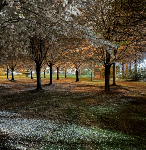
<div class="tintimg" style="--bgcolor: rgba(255, 183, 197, 0.65); --bgimg:url(/example/tree.thumb.jpg); color: #1F1618;">桜</div>
This style uses image as background. Search engines will ignore this image because they expect the image in <img> element. Do not use this style if you would like your image to bve indexed.
sidebyside
You may want to place two (or more) elements side-by-side (horizontal layout) for comparison.
<div class="sidebyside">
	<img src="/example/rail.thumb.jpg" alt="Railway" />
	<img src="/example/fall.thumb.jpg" alt="The Great Fall" />
</div>


By default, you can place two items side-by-side at 50-50 width, 10px gap between. To place more than two items or to set different width, or different gap size, set the gap and grid-template-columns style rules:
<div class="sidebyside" style="grid-template-columns: 300px 2fr 1fr; gap: 25px;">
	<img src="/example/tree.thumb.jpg" alt="Sakura" />
	<div>Text A ratio 2</div>
	<div>Text B ratio 1</div>
</div>
The above example shows 3 items, the first item (a picture) uses 300px of horizontal space. The second item (text A) and the third item (text B) consume the remaining space at 2-1 ratio. 25px gap between items.
One narrow screen where multiple items are not favoured, items will be placed in vertical layout.
Table
| Row | Column A | Column B | Column C |
|---|---|---|---|
| Row 1 | The quick brown fox jumps over the lazy dog. | The quick brown fox jumps over the lazy dog. | The quick brown fox jumps over the lazy dog. |
| Row 2 | The quick brown fox jumps over the lazy dog. | The quick brown fox jumps over the lazy dog. | The quick brown fox jumps over the lazy dog. |
Compared to the vanilla HTML table, the Bearweb page template provides a more clear table style, and it provides a horizontal-scrollable container to ensure a wide table won’t overflow a narrow page on a cellphone screen.
To do so, simply wrap a <table> in a <div class="tablewrap"> element:
<div class="tablewrap"><table>
	<caption>Example Table</caption>
	<thead>
		<tr>
			<th scope="col">Row</th>
			<th scope="col">Column A</th>
			<th scope="col">Column B</th>
			<th scope="col">Column C</th>
		</tr>
	</thead><tbody>
		<tr>
			<th scope="row">Row 1</th>
			<td>The quick brown fox jumps over the lazy dog.</td>
			<td>...</td>
			<td>...</td>
		</tr><tr>
			<th scope="row">Row 2</th>
			<td>...</td>
			<td>...</td>
			<td>...</td>
		</tr>
	</tbody>
</table></div>
Code and Code Block
Inline code has a grey background, for example: int i = 0.
To inline a code segment in HTML, just wrap the code segment in a <code> element. For example:
<p>Inline code has a grey background, for example: <code>int i = 0</code>.</p>
Code block provides a horizontal-scrollable container to ensure a wide code block won’t overflow a narrow page on a cellphone screen.
$include <stdio>
int main() {
	int i = 10086;
	printf("Hello int %d\n", i);
	return 0;
}
Following code renders the example:
<pre><code>
$include <stdio>
int main() {
int i = 10086;
printf("Hello int %d\n", i);
return 0;
}
</code></pre>
Remember to escape the following HTML special characters in raw code:
&(and sign) -->&<(less than) --><>(greater than) -->>
Image and Figure
To insert an image, use:
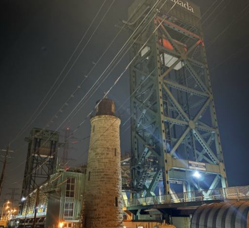
<img src="/example/bridge.thumb.jpg" alt="Lift bridge" />
where:
src- Link to the image.alt(Optional) - Alternative text, description of this image in case the image cannot be loaded. Highly recommended for user accessibility.
Bearweb page template comes with a in-page image viewer. Visitor can click the image to zoom-in the image, view its HD version (if supplied) and other information about this image.
In-page Image Viewer
If you would like to enable the in-page image viewer, enclose the <img> element in a <figure> element and supply additional data. For example:
<figure>
	<img src="/example/bridge.thumb.jpg" title="Lift bridge" alt="Lift bridge" data-hd="/example/bridge.jpg" data-keywords="Bridge, Engineering, Landmark" data-description="An old lift bridge on the lake bank." />
	<figcaption>An old lift bridge.</figcaption>
</figure>
where:
src- Link to the image (thumbnail).alt(Optional) - Alternative text, description of this image in case the image cannot be loaded. Highly recommended for user accessibility.title(Optional) - Image title.data-title(Optional) - Used iftitleis not provided.data-hd(Optional) - Link to the image (HD).data-keywords(Optional) - Comma-seperated keywords.data-description(Optional) - Image description.figcaption(Optional) - Caption displayed under the image. Highly recommended for user accessibility.
The in-page image viewer shows the following information:
- The image specified by
src. Ifdata-hdis supplied, the HD image will be downloaded at background and replace the thumbnail (src) once ready. - Buttons to close the viewer, to open the thumbnail (
src) and the HD (data-hd) images in a new tab. - Title if
titleordata-titleoraltis provided. If not provided, will use will usesrc. - Description if
data-descriptionis provided. - Caption if
figcaptionis provided. - Keywords in hashtag style if
data-keywordsis provided.
The in-page figure is limited to 600px wide. This works great in most case; in case you want to remove the width limit, add attribute data-wide.
<figure>
	<img src="/example/bridge.thumb.jpg" title="Lift bridge" alt="Lift bridge" data-wide="" />
	<figcaption>An old lift bridge.</figcaption>
</figure>
Horizontal List
Use <div class="list_horizontal"> to place items in a horizontal-order grid-like list.
<div class="list_horizontal">
<img src="/example/river.thumb.jpg" />
<div style="background: #FAA content-box;"><p>Some mixed text.</p></div>
<img src="/example/rail.thumb.jpg" />
<div style="background: #AFA content-box;"><p>More mixed text.</p></div>
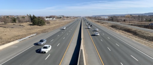
<img src="/example/highway.thumb.jpg" />
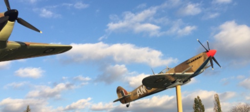
<img src="/example/fighter.thumb.jpg" />
<div style="background: #AAF content-box;"><p>Even more mixed text.</p></div>
</div>
The above code will generate the following list:

Some mixed text.
More mixed text.
Even more mixed text.
In the above example, the highest item in a row determines the height of that row. To force items in the same row the same height, replace all <img>s with <div>s, set background to the image.
<div class="list_horizontal">
	<div style="background: center/cover url(/example/river.thumb.jpg);"></div>
	<div style="background: #FAA content-box;"><p>Some mixed text.</p></div>
	<div style="background: center/cover url(/example/rail.thumb.jpg);"></div>
	<div style="background: #AFA content-box;"><p>More mixed text.</p></div>
	<div style="background: center/cover url(/example/highway.thumb.jpg);"></div>
	<div style="background: center/cover url(/example/fighter.thumb.jpg);"></div>
	<div style="background: #AAF content-box;"><p>Even more mixed text.</p></div>
</div>
The above code will generate the following list:
Some mixed text.
More mixed text.
Even more mixed text.
Bearweb page template has a default rule, that is, narrow screen has 1 column, middle screen has 2 columns, wide screen has 3 columns. You may change this rule by giving the list an ID and providing a custom style on the page. For example:
<div class="list_horizontal" id="list_horizontal_customsize">
	<img src="/example/river.thumb.jpg" />
	<div style="background: #FAA content-box;"><p>Some mixed text.</p></div>
	<img src="/example/rail.thumb.jpg" />
	<div style="background: #AFA content-box;"><p>More mixed text.</p></div>
	<img src="/example/highway.thumb.jpg" />
	<img src="/example/fighter.thumb.jpg" />
	<div style="background: #AAF content-box;"><p>Even more mixed text.</p></div>
</div>
<style>
	#list_horizontal_customsize { grid-template-columns: repeat(4, 1fr); }
	@media (min-width: 800px) {
		#list_horizontal_customsize { grid-template-columns: repeat(8, 1fr); }
	}
</style>
The above code will generate the following list:
Some mixed text.
More mixed text.
Even more mixed text.
Verticle List
Use <div class="list_verticla"> to place items in a vertical-order column-like list.
<div class="list_vertical">
	<img src="/example/bridge.thumb.jpg" />
	<div style="background: #FAA content-box;"><span>Some mixed text.</span></div>
	<img src="/example/river.thumb.jpg" />
	<div style="background: #FAF content-box;"><span>Another mixed text.</span></div>
	<img src="/example/rail.thumb.jpg" />
	<div style="background: #AFA content-box;"><span>More mixed text.</span></div>
	<img src="/example/highway.thumb.jpg" />
	<img src="/example/fighter.thumb.jpg" />
	<div style="background: #AAF content-box;"><span>Even more mixed text.</span></div>
</div>
The above code will generate the following list:
Bearweb page template has a default rule, that is, narrow screen has 2 column, middle screen and wide screen has 3 columns. You may change this rule by giving the list an ID and providing a custom style on the page. For example:
<div class="list_vertical" id="list_vertical_customsize">
	<img src="/example/bridge.thumb.jpg" />
	<div style="background: #FAA content-box;"><span>Some mixed text.</span></div>
	<img src="/example/river.thumb.jpg" />
	<div style="background: #FAF content-box;"><span>Another mixed text.</span></div>
	<img src="/example/rail.thumb.jpg" />
	<div style="background: #AFA content-box;"><span>More mixed text.</span></div>
	<img src="/example/highway.thumb.jpg" />
	<img src="/example/fighter.thumb.jpg" />
	<div style="background: #AAF content-box;"><span>Even more mixed text.</span></div>
</div>
<style>
	#list_vertical_customsize { columns: 3; }
	@media (min-width: 800px) {
		#list_vertical_customsize { columns: 4; }
	}
</style>
The above code will generate the following list: